ShopDreamUp AI ArtDreamUp

Deviation Actions


Suggested Deviants


![Story telling [April's MAWP]](https://images-wixmp-ed30a86b8c4ca887773594c2.wixmp.com/f/6fc4070c-66ea-4776-84bc-49b89500d123/dduj10v-1817bf2e-a0dd-46da-bf13-6b16359cf709.png/v1/crop/w_92,h_92,x_8,y_0,scl_0.030666666666667/story_telling__april_s_mawp__by_auremun_dduj10v-92s.png?token=eyJ0eXAiOiJKV1QiLCJhbGciOiJIUzI1NiJ9.eyJzdWIiOiJ1cm46YXBwOjdlMGQxODg5ODIyNjQzNzNhNWYwZDQxNWVhMGQyNmUwIiwiaXNzIjoidXJuOmFwcDo3ZTBkMTg4OTgyMjY0MzczYTVmMGQ0MTVlYTBkMjZlMCIsIm9iaiI6W1t7ImhlaWdodCI6Ijw9MTQ0MCIsInBhdGgiOiJcL2ZcLzZmYzQwNzBjLTY2ZWEtNDc3Ni04NGJjLTQ5Yjg5NTAwZDEyM1wvZGR1ajEwdi0xODE3YmYyZS1hMGRkLTQ2ZGEtYmYxMy02YjE2MzU5Y2Y3MDkucG5nIiwid2lkdGgiOiI8PTE5MjAifV1dLCJhdWQiOlsidXJuOnNlcnZpY2U6aW1hZ2Uub3BlcmF0aW9ucyJdfQ.DRwJqxtUcx8zWdXTQZ7SuU9R1zSG9NzHnNDrz5SPyAM)


Suggested Collections


You Might Like…


Featured in Groups

Comments19
Join the community to add your comment. Already a deviant? Log In
From 
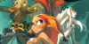
This is a pretty good piece. You've got a pretty good sense of color. It has quite a bit of life to it, and the image itself really just stands out. The coloring itself is actually very simple. Not too many shades to distinguish around the bodies, but that simplicity also helps give a rather friendly and appealing look to it. The shapes themselves are pretty good, has a nice round and sort of friendly feel to it, further adding to the image. The background is also good. Although, I will admit that it does look a bit off, when compared to the rest of the image, it is a simple nitpick that can easily be ignored. The background isn't bad. In fact it looks great, it just feels that the style choice just has too much of a realistic feel, kinda contrasting the cartoonish designs.
Now, what I will actually nip a bit are the eyes. Personally, I feel that the outlines for the eyes are a little too thin. One of the key focuses for expression, are the eyes. They need to stand out a bit more. A simple fix would make the lines a bit bolder. Not too bold, but just similar to the eyes of the pet on his lap.
Overall, great work here. Keep it up!